
Data visualization - what are dashboards and how do they support the business
The right use of data is in everyone's interest - the consumer's, to present relevant, personalised information, and the company's, to make more effective, data-driven business decisions. But data alone is not enough, it is very important to process and interpret it. The many different data visualisation systems help in this process.
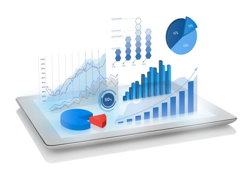
Why do we need data visualisation?
Data is the oil of the 21st century - you hear this from many places, yet in our country it is still a rapidly emerging new industry. Today we have reached a level of technology where we measure everything, we have data on everything - even if it's sometimes scary - and if used properly, it can be of huge business benefit. But it is also a disadvantage, like the problem of the knights of old - that 60 kilos of armour was a very formidable sight, but if it fell off the horse, it couldn't get up by itself. It's a bit the same with data, we get so much data from so many different sources nowadays, disorderly of course, that it often confuses rather than helps.
The right use of data is in everyone's interest - the consumer's, to present relevant, personalised information, and the company's, to communicate more effectively and make better, data-driven business decisions.
But data alone is not enough, it is very important to process and interpret it.
This process is aided by the many different data visualisation systems.
Which data visualisation system is the best? This is not a clear-cut question and will be addressed in another post. In short, it is determined by the sources from which data comes and the visualizations that can be extracted from them. The three leading data visualisation systems are Tableau, Microsoft Power BI and Google Data Studio. Nitro Communications is an expert in all three of these systems, and we're going to show you what they can do using the Google Data Studio tool.
Data visualisation at its best - what is Dashboard?
Before we dive deep into data visualization interfaces, let's dispel a misconception: Google Data Studio is not an alternative to Google Analytics dashboards. If you want an analogy: where Analytics Dashboard is a fancy garage with nice cars, Data Studio is the Dubai airport.
It already takes the processing and visualisation of Google Analytics data to a higher level, but its real value is the use and integration of many different data sources.
Check out some of the commonly used Datastudio dashboard types.
Benefits of data visualisation
The main advantage of data visualization dashboards is that they combine disparate data sources.
A few examples of data sources that can be merged are Google Analytics, Adwords, YouTube, Search Console, CRM, SQL, Amazon Sellers, AdStage, Ebay, Twitter, Facebook Ads and Ingights and many more.
Another big advantage of data visualization is the outstanding security. Most data visualisation interfaces have dynamically adjustable security levels, so users can be given different access to different pages of a report - or denied access if, for example, it's the top-level content of a report.
We've left the most attractive benefit to the end: goodbye to pdf and excel reports, visualisations, the era of interactive and dynamic elements in data visualisation is here. How much better to be able to customise the details of the report according to the needs of the user? Here's what we mean:
Enjoy the benefits of dynamic reports - your dashboards can even display real-time data. You can assign different time periods to each element of the report - current, last month and last year side by side - each element can be customised.
Dynamic element examples:
- Period
- Country, region, city/town
- Country, region, city, city, region, region, country, region, country, region, country, region, country, region, country, region, etc.)
- Device type (Tablet, Mobile, PC)
- Mobile, mobile, mobile, mobile...etc)
- Any dimension of company data (e.g. division or product group)
Use of interactive elements: elements of the report come to life - maps, graphs, tables don't have to remain one dimensional.
For example, click on a region in a table to see a further breakdown of the region - the report metrics are automatically updated accordingly. Curious about the performance of your region in Northern Hungary? it's just a click away.
Or if you simply select the desired period in the graph, the metrics will be updated automatically.
The user can also select the country on the map and the chart is updated with the country breakdown.
These and other interactive features help users to better and more easily understand the data in a more attractive, visual format.
Getting started with data visualisation
There are several approaches to data visualisation: what do you want to see or what data do you have. From a business point of view, of course, the best approach is to do a comprehensive performance analysis, assessing what's influencing the way your business is doing, the people involved in your processes - suppliers, warehousing, transportation, manufacturing... and everything else.
But you often have to make trade-offs: first, if you don't have the right data to measure the process, or if you can't update the data with sufficient frequency, or if you have too much data to enter manually and the process is long.
The Nitro Communications team has extensive experience in data analysis and processing. Take a look at our extended digital portfolio and let's explore together which areas of your business we can help.