
Data visualization - type of dashboards
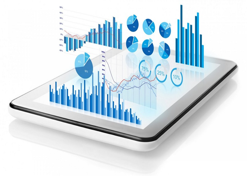
The right use of data is in everyone's interest - the consumer's, to present relevant, personalised information, and the company's, to make more effective, data-driven business decisions. But data alone is not enough, it is very important to process and interpret it. The many different data visualisation systems help in this process.
Data Visualisation - Types of Dashboards
Virtually everything that has data can be visualised. Web performance, social media performance, competitors, keywords, call center efficiency, but you can also visualize for example the US presidential election process, how it changed depending on the processing power of each region. Or the number of NBA players over the last 20 years who were NVP players. We've seen Star Wars Data Studio report as a function of size and speed of each spacecraft.
Below we've put together some example dashboard reports of the most useful ones:
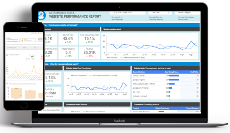
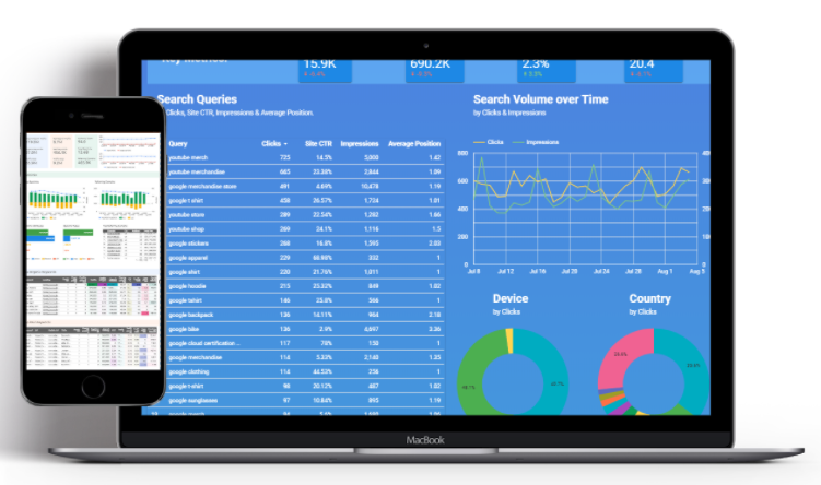
Web performance dashboard
Web site performance visualization in an easy to understand way. Visitor behaviour, conversion performance, dropout reasons, all through a lightweight, clean visualisation. Compare your website's current performance data with previous periods and see trends and continuous change. Demographic breakdown, interest patterns, events and goal achievement - all through an interactive and dynamic visualisation. Selectable data sources and time bands, with a range of filtering options: demographic characteristics, events, goal achievements and more.
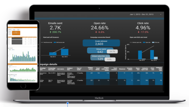
Marketing automation and email reporting dashboard
One of the most effective use cases for a quick and easy overview of your automated marketing. Thanks to interactive features, marketing automation can be viewed in full or in detail.
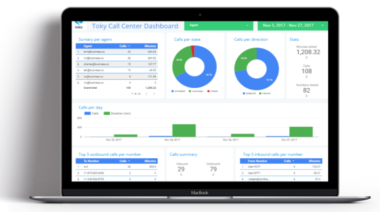
Call center dashboard for performance measurement
For internal call centers, easily and visually track the performance of all callers, making it easy to test and compare different scripts. And when using an external call centre partner (either campaign-based or permanent), you can easily monitor the performance of the partner without having to spend extra time on reporting. Optimized outbound calls: most efficient by area, by caller ID, even by industry. Call effectiveness, average call time, daily performance per caller, its variation and much more.
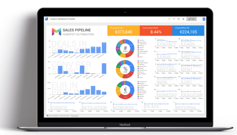
CRM report and sales performance dashboard
Ever wonder how many times a customer encounters your brand before becoming a customer? Now you can find out.
Discover and analyze the customer journey quickly and easily! Know the exact ROI and CPA after connecting to paid media channels. Discover the contribution of these systems to your KPI goals. Evaluate your sales force's ongoing performance, knowing the ins and outs will help you get the most out of your sales team! Many CRM systems can be integrated with DataStudio automatically: SalesForce, Hubspot, Marketo, Pipedrive, Zoho CRM, Microsoft Dynamics, Active Campaign, Freshsales and many more can be integrated with Zapier. You can quickly and easily review your performance even in real-time.
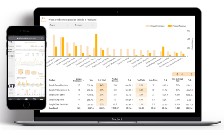
Ecommerce and PPC dashboard
If you provide online shopping for your visitors, this Dashboard is for you. Purchase volumes, unique purchases, average cart/price are all included as key metrics. What's magical about this report is that it doesn't overwhelm you with data - despite the fact that there are so many decision factors that influence ecommerce. Filters allow you to select one or more brands and/or products whose data you can analyse. Each section is equipped with interactive functions (e.g. product/brand selection), so that it can meet the user's individual needs. Visualised trends and comparison with historical data are also available.
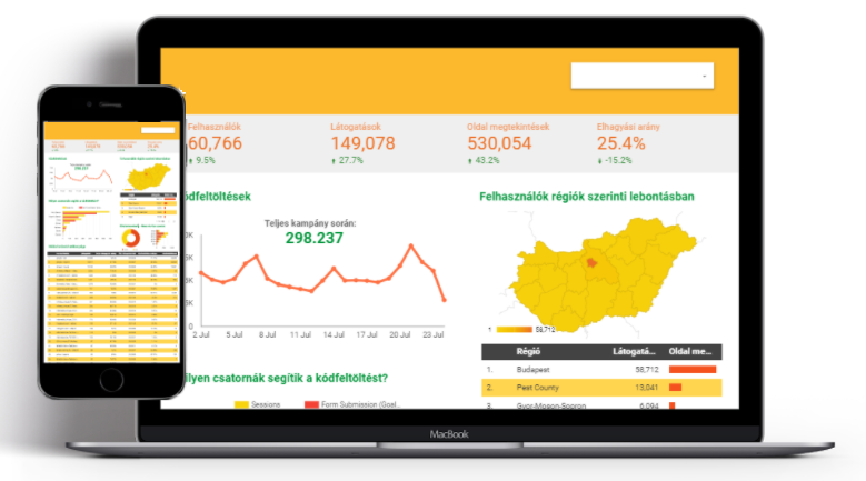
Campaign summary dashboard
Perfect for online and offline campaign summary reporting, it is an excellent way to visualise trends in campaign KPIs and other metrics. Thanks to the country map, it is possible to visualise consumption/branding/code uploading/other KPIs during the campaign in a regional breakdown, e.g. Hungary on a county map.
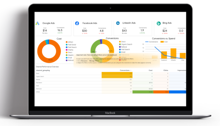
Multi Channel dashboard
This is one of the most popular uses of Data Studio. Data from multiple advertising systems can be visualised in a clear, easy-to-use reporting interface. Unlimited number of systems can be combined on the interface, in this example the data of Google Ads, Facebook Ads, Linkedin Ads, Bing Ads accounts are visualized on one interface, so it is easy to compare cost, volume and quality of conversions. Thanks to a plugin of DataStudio, even permanent automatic updates can be set up.
SEO report dashboard - even about competitors
Many different SEO reports can be generated, providing an excellent visualisation of the distribution of organic search traffic for the site or industry of interest. A complete 360 degree overview of the SEO results and characteristics of the site, broken down by key aspects, a kind of SEO SWOT analysis. With the help of an external tool, you can even get a detailed assessment of your competitors' site traffic. The above report was produced from the ebay site without ebay giving access to its data or permission to produce the report. For sites with higher traffic, this software can also measure the current running campaigns of competitors, their traffic breakdown, creatives, and overall PPC spending levels.
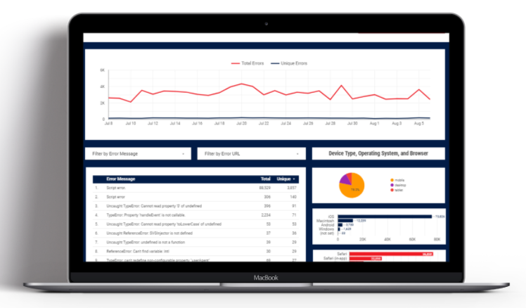
Javascript error fixing report
It is often the case that even when testing a new interface before launch, they cannot eliminate all the technical errors. How many times does it happen that someone gets a digital interface with a bug, but when it is reported to the technicians, they are unable to show the bug. It's over! The javascript error logging report records the javascript error(s) of each visit, with a detailed error message, on what interface, device and browser it appeared. This way, developers can easily fix the error and not have to burn unnecessary hours/days tracking down the source of the error.
Social media post dashboard with interactive content
These reports can be based on TV series/movie data, sporting event statistics, changes in any environmental event, even animal species numbers, or any popular topic. One of the most popular alternative uses of the system is to support Social Media by creating interactive content. Some examples are: Marvel VS DC movie-goers worldwide (with country breakdowns); Game of Thrones characters' appearance time report, Star Wars report - comparison of vehicle speed and character popularity, International Space Station current status, San Francisco Passenger Totals, and here is an NBA MVP summary with data from the last 70 years. View the full report
Initial steps of data visualisation
There are several approaches to data visualization: what do you want to see or what data do you have. From a business point of view, of course, the best approach is to do a comprehensive performance analysis, assessing what's influencing the way your business is doing, the people involved in your processes - suppliers, warehousing, transportation, manufacturing... and everything else.
But you often have to make trade-offs: first, if you don't have the right data to measure the process, or if you can't update the data with sufficient frequency, or if you have too much data to enter manually and the process is long.
The Nitro Communications team has extensive experience in data analysis and processing. Take a look at our extended digital portfolio and let's explore together which areas of your business we can help.